Foodhunt

A shopping app that walks you through the supermarket one item at a time, designed for people with cognitive disabilities. The demo is real: add items, start a shop, follow the route.

Navigation

Navigation

70% of our research participants, disabled and non-disabled, said their biggest challenge in supermarkets was simply finding things. Foodhunt generates an interactive map that guides users item-by-item through the store, so they always know where they are and where they're going next.

Assistance

Communication

Most in-store help requests (70 to 80%) are just asking where something is. Foodhunt handles that before you ever need to talk to anyone, narrowing location by shelf and row, then offering image-based search, and only escalating to staff as a last resort.

Less to hold in your head

Distraction

The app plans the entire shopping journey upfront, a structured route that reduces decision-making, limits distractions, and keeps users focused on what they came for. For autistic users, that means less sensory overload. For users with ADHD, fewer opportunities to lose the thread.

Tap to try it

The problem

Supermarkets are high-stimulus, information-dense places. For people with cognitive and learning disabilities such as dyslexia, ADHD and ASD they are often actively hostile rather than neutral: layouts are hard to navigate, signage is unclear or inconsistent, help is hard to get, and lighting, noise, crowds and clutter overload the senses. These barriers do not just slow shopping down; they add stress and take away independence. Accessibility in supermarkets is still framed almost entirely around physical mobility, and cognitive accessibility is left out.

The project

A semester-long group project in DECO3200, Interactive Product Design Studio, over 13 weeks. The course asks you to identify, justify and respond to a real problem space through research-led product design rather than jumping to a solution.

Scope

We took the studio’s UX stream, so the focus was on user experience and product thinking: defining the problem, grounding decisions in research, and justifying why an intervention was worth building. Less emphasis on polished UI or engineering feasibility. We built wireframes and flows in Figma, and there was no expectation of a production-ready prototype. The value sat in the problem framing, the research and the logic of the proposed system.

My role

Four of us, with responsibilities deliberately spread. I took a stronger leadership role, guiding the direction and keeping the work aligned with the problem statement.

I shaped the research approach, contributing heavily to the secondary research and to the design of the primary research and user testing. I was solely responsible for the wireframes and interaction flows in Figma, turning the testing insights into a coherent product structure and user journey.

After the university project wrapped up I built and coded the working demo at the top of this page on my own, with Claude Code and Cursor, as a proof of concept and an experiment in AI-assisted development.

Research

Before talking to anyone we needed to know what accessibility means in a supermarket, what had been tried, and where the gaps were. Then we talked to people. Three of the four of us live with a cognitive disability; we were not designing for an abstract user group.

What we read

Secondary research

We started by mapping the accessibility landscape, visual, auditory, physical and cognitive, then deliberately zoomed into cognitive and learning disabilities, because supermarkets are sensory-rich environments where attention, memory, processing load and decision-making are constantly taxed.

The key takeaway was that “accessibility” in a supermarket is not just screen readers and ramps. It includes wayfinding and spatial clarity (how easily someone forms and keeps a mental map), information readability (font size, label density, signage), cognitive load and decision pressure (choice overload, price comparison, interruptions), and environmental stressors (noise, lighting, crowds, clutter). We used that framework to map where breakdowns happen:

Where each cognitive need breaks down, by supermarket touchpoint
NavigationLabelsAssistanceCheckout
AttentionDifficulty staying oriented in long aislesMissed promotional tags and important infoHard to notice staff availabilityDistraction leads to missed steps
MemoryForgetting item locationsDifficulty recalling product differencesForgetting what to askLosing track of budget and items
ProcessingOverwhelming layout complexityDense, hard-to-parse labelsUnclear instructionsConfusing payment flows
SensoryBright lights and noise affect wayfindingVisual clutter on packagingSocial anxiety in interactionsOverstimulation at busy checkouts

We also looked at accessibility audit methods, checklists and observation techniques, for evaluating how well an environment supports different users. That gave us a lens for analysing supermarkets as systems rather than interfaces, which paid off later in the walkthroughs.

Finally, we grounded the work in the Australian legal and ethical context, including the Disability Discrimination Act 1992, as a reminder that exclusion is usually a design decision by default rather than a compliance checkbox.

Competitor analysis

We evaluated existing tools for whether they reduce cognitive load or accidentally add to it, not just for their features.

Coles app

Product info, deals and checkout, but no in-store aisle guidance and no accessibility features beyond the basics. None of the Australian supermarkets have a navigation, list or assistance app of any kind.

Scan & Go trolleys

Scan, bag and pay from your phone, so less queueing. It also limits staff interaction, gives no aisle guidance and can overstimulate. A convenience product, a different category from ours.

MappedIn

Item maps for warehouse staff filling orders. Navigation, but for internal logistics, with no accessibility features for shoppers.

Hong Kong airport signage

Colour-coded, well-placed signage that guides passengers with very little friction. The closest thing to our idea: navigation that is accessible by design.

Competitors against the three insights
NavigationAssistanceDistractions
Coles appNoNoNo
Scan & GoNoNoPartly
MappedInYesNoPartly
HK airport signageYesNoYes

Most solutions optimise for efficiency or sales, not for cognitive accessibility. Foodhunt targets navigation, clarity and assistance in a way that scales to many shoppers, not just expert ones.

Who we asked

Interviews, surveys, in-store observation and online ethnography. Across all of it the same story kept coming back: supermarkets are built around store logic, not human cognition.

15 pages

Secondary research into cognitive disabilities, accessibility frameworks and design patterns

9 interviews

In-depth sessions, 20 minutes or more each, with people living with cognitive and learning disabilities

32 responses

Targeted survey of people with cognitive and learning disabilities

100+

General supermarket shopper survey responses

Interviews

We ran nine semi-structured interviews with people with ADHD, dyslexia, ASD and memory difficulties, plus one supermarket staff member who worked across online picking and nightfill. Transcripts were grouped with affinity diagrams into four areas: navigating stores, signage, reducing cognitive load, and the wider shopping experience.

What the interviews found

People navigate supermarkets through memory, not signage. Navigation

Participants relied on positional memory and mental maps built over repeated visits. Once that internal map exists, shopping feels manageable. When a layout changes, or in an unfamiliar store, the map collapses and frustration spikes. Aisle signage was described as too broad, inconsistent, or unable to represent what an aisle actually holds.

“The signs on the aisles, they’re pretty useless most of the time.”
“You’re trying to encapsulate a whole aisle in a couple of words. That just doesn’t work.”

Category logic often conflicts with how people think. Navigation

Products grouped by brand, origin, promotion or “inspiration” rather than by how people associate them. Toothpaste apart from bathroom items, sauces apart from their cuisines. People scan whole aisles, double back, or give up on an item.

“Sometimes things are sorted by brand, other times by country, other times just scattered.”

Cognitive load accumulates through small frictions. Distraction

Almost nobody described one catastrophic problem. Stress came from stacking small ones: unclear signage, dense shelves, bright lighting, noise, crowds, promotional clutter, time pressure. For people with ADHD or ASD that became distraction, decision paralysis, or a strong wish to get in and out as fast as possible.

“There’s just a lot going on. It’s more interactive than it needs to be.”

Help exists, but people avoid using it. Communication

Asking staff was a last resort, not a support mechanism: social anxiety, difficulty finding staff, low confidence they would know, or a bad previous experience.

“I don’t feel confident asking, and half the time they just point to an aisle anyway.”

Avoidance is already a coping strategy. Distraction

Several participants avoid large supermarkets, busy hours, certain aisles or certain stores altogether. Others shop off-peak, rush, or abandon items when the friction gets too high. Accessibility problems do not just slow people down. They change behaviour.

“I just want to leave as fast as possible.”
The interviews showed that the problem is not a lack of effort from shoppers but an environment that demands constant cognitive work. Navigation, categorisation and assistance all rely on people adapting to the store rather than the store supporting different ways of thinking.

Affinity diagramming

Three weeks of data from four people running interviews, surveys, observations and ethnography in parallel is a lot of raw material. We needed a way to make sense of it and turn it into something we could design from.

We started at a whiteboard and turned every piece of primary research into a single data point: a finding, a quote, a behaviour, an observation. Then we grouped by similarity, iterating until roughly eight themes emerged, around pain points, disability-specific experiences and behavioural patterns. The three insights below were distilled from those themes.

Three insights

Everything we heard sorted into three problems. Every section from here is tagged with the one it serves.

Navigation

Difficulty finding itemsOdd locations, odd categories, confusing layouts
Navigation

Layout confusion

  • Products grouped by brand in one store, by category in another
  • Moved items with no indication of where they went
  • Had to walk every aisle just to find pasta sauce

Mental mapping

  • I only know where things are because I've been coming here for years
  • New stores are basically impossible without help
  • If they rearrange, my whole system breaks
Signage doesn't helpHard to read, too broad, sometimes missing entirely
Navigation

Signage readability

  • Font is too small to read from the end of the aisle
  • Signs say 'International Foods' but that could be anything
  • Some aisles just don't have signs at all

Category mismatch

  • Toothpaste is in 'Health and Beauty' not 'Bathroom'
  • You're trying to encapsulate a whole aisle in a couple of words
  • I guessed wrong three times before I found it
No product availability infoEmpty shelves, unclear substitutes, wasted trips
Navigation

Stock uncertainty

  • Went specifically for one item and the shelf was empty
  • No way to know before going whether they have it
  • Staff said 'try tomorrow' which doesn't help me right now

Substitution difficulty

  • I don't know what's a good alternative if my item isn't there
  • Decision paralysis kicks in when my plan falls apart

Communication

People avoid asking for helpSocial anxiety, bad experiences, guilt
Communication

Emotional barriers

  • I feel like I'm interrupting them
  • I don't feel confident asking
  • It feels stupid to ask where the bread is

Past negative experiences

  • Half the time they just point to an aisle anyway
  • I asked once and the staff member didn't know either
  • They seemed annoyed, so I stopped asking
Staff can't always help anywayHard to find, unsure of answers, inconsistent knowledge
Communication

Availability

  • You can never find someone when you actually need them
  • They're always stocking shelves or busy

Knowledge gaps

  • Staff are often new and don't know the layout
  • They pointed me to the wrong aisle twice
  • Online picking staff know better than floor staff
No other way to get assistanceWhen staff aren't the answer, there's nothing else
Communication

Digital gap

  • The app tells me what's on sale but not where anything is
  • No search function for in-store location

Workarounds

  • I just Google it and hope for the best
  • Sometimes I call ahead to check if they stock something

Distraction

Overstimulating environmentsCrowds, lighting, noise, dense shelves
Distraction

Sensory overload

  • The fluorescent lights give me headaches after 20 minutes
  • Music plus announcements plus people talking is a lot
  • There's just a lot going on. It's more interactive than it needs to be

Physical environment

  • Aisles are too narrow when other people are in them
  • Shelves packed floor to ceiling feel claustrophobic
Decision paralysisToo much choice, hard to compare, fear of the wrong pick
Distraction

Choice overload

  • There are 40 types of pasta sauce and I can't tell the difference
  • I could spend an hour comparing things if I don't have a plan
  • The worry that we might choose the wrong option gives us unwanted stress

Label difficulty

  • Nutritional info is tiny and dense
  • Price per unit vs price per item confuses me every time
Impulse buyingSales, promotions, hunger, unstructured roaming
Distraction

Triggers

  • Sale stickers pull my attention even when I don't need the item
  • Limited edition stuff creates fear of missing out
  • Shopping hungry is a disaster every time

Loss of structure

  • If I don't have a list I just wander and grab things
  • I end up buying stuff I already have at home
  • Getting off track is where the overspending happens

People with cognitive and learning disabilities, such as dyslexia, ADHD and ASD, face significant barriers in supermarkets because the environment is not designed to be accessible to them.

Ideation

Wide before narrow. Brainstorming, brain-writing, Crazy 8s and reverse thinking, across every pain point we had found, with no filtering for quality yet.

How the ideas combined

The strongest concept did not come from one brainstorm. It came from combining separate ideas that each addressed part of the problem: structured shopping lists Distraction, map-led wayfinding Navigation and refreshed aisle signage Navigation.

Each of us pitched ideas to the group, the impractical ones included, and we built on top of them: adding features, naming advantages, connecting them to pain points from the research. Nothing came off the table at this stage. The narrowing came later, through a decision matrix.

Other ideas we explored

The decision matrix

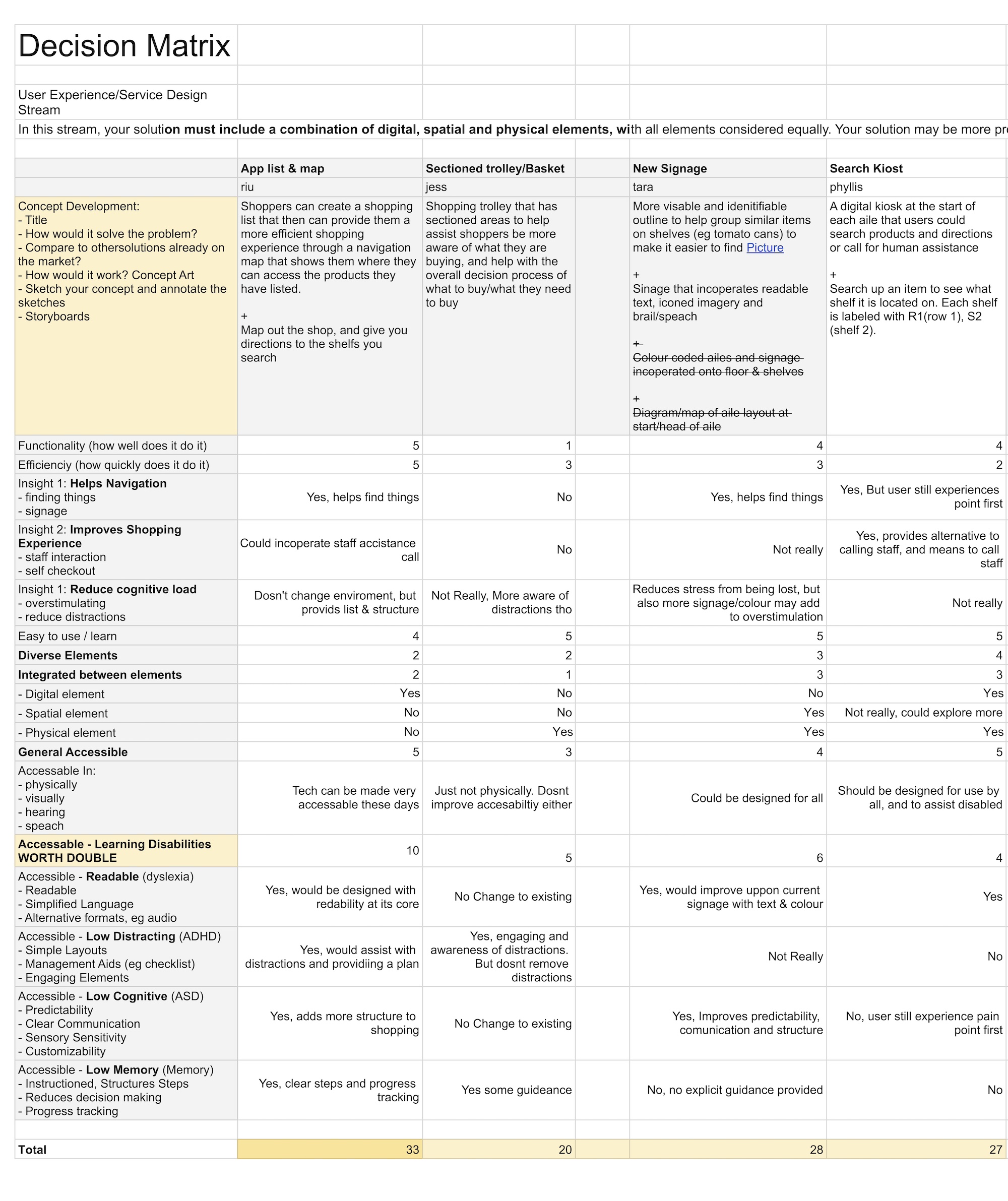
With a wall of ideas in front of us we scored each one against the three insights (Navigation, Communication and Distraction), general accessibility criteria, and specific support for dyslexia, ADHD, ASD and memory impairment.

The winner: a shopping list and map app. It scored highest across the board because it could realistically address navigation, assistance and cognitive load in one interface, while meeting the accessibility standards from the secondary research.

Why this concept won

It covered all three insights directly.

Navigation Navigation through in-store mapping and guided routing.

Communication Communication through built-in assistance that reduces the need to find and ask staff.

Distraction Distraction through structured lists and planned routes that keep people focused.

It supported the disability-specific needs we had researched: simple language and audio alternatives for dyslexia, minimal layouts and checklists for ADHD, predictable interfaces and sensory settings for ASD, step-by-step guidance with progress tracking for memory impairment. It also met the general benchmarks for physical, visual, auditory and speech accessibility.

One constraint: the brief required the solution to span digital, physical and spatial design, which is how a physical sectioned basket entered the concept. It was later dropped after testing showed it did not work.

The decision matrix: concepts scored against the research insights and accessibility criteria
The full matrix, in Google Sheets

Prototyping

Three kinds of prototype: digital, spatial and physical. Each tested a different part of the concept, from screen-level interaction to how someone moves through a store with the app guiding them.

Digital

NavigationCommunicationDistraction

Sketches

We started on paper, sketching the core screens and annotating how they connected. The shopping list, basket divider, navigation directions and post-shop overview were all roughed out here, with notes on why each element existed and which pain point it addressed. Even at this stage there were accessibility touches: a microphone icon for voice input, a help button that is always reachable, and progressive disclosure in the navigation (a simple direction first, with the option to tap for more detail).

User testing

Three rounds, each building on the last, every one measured against the three insights so we could tell whether the design was solving the problems we had found and not just whether it was usable.

Round 1: Preliminary testing

Round 1 tested the prototype, not the idea. We had one shot at a large user testing fair later in the semester, with close to 200 participants, and could not spend that day debugging the UI. So we ran think-aloud sessions first, with users working through nine core features while narrating: adding and removing items, navigating the store, using the basket, moving the figurine through the spatial model.

The goal was to find everything broken or confusing now, fix it, and bring a working prototype to the fair.

What we found

The basket failed completely. No user understood it from the app’s explanation alone; every participant asked us. Even once they understood it, most ignored it and put items in unsectioned. We added an onboarding animation showing the basket being divided, with clearer instructions.

The app also lacked feedback. Add an item and nothing happened visually; start navigation and nothing confirmed it was working. We added confirmation states throughout: item added, starting shop, progress indicators.

Beyond those, dozens of smaller issues: unclear icons, confusing transitions, button placement, colour contrast. All things that would have eaten testing time at the fair.

Evaluation

Did Foodhunt address the problems from the research? Not just whether it was usable, but whether it moved navigation, communication and distraction.

Across four SUS respondents Foodhunt averaged 69.4, just above the industry benchmark of 68. For a mid-fidelity Figma prototype that is a solid baseline. Learnability scored highest: all four agreed most people would pick the app up quickly. Slightly lower scores on confidence and consistency point at the prototype’s fidelity rather than the concept. All four think-aloud participants said they could see themselves using it.

Evaluation goals by insight, with result and summary
InsightGoalResultWhat happened
NavigationProduct findingMetUsers found items directly instead of wandering
NavigationStore navigation clarityPartially metThe route worked; map orientation needed iteration
NavigationTime savingMetAll users reported faster shopping with the app
CommunicationReduced staff relianceMetLocation self-service reduced help-seeking
CommunicationEffective communicationPartially metThe call feature worked but needed more modalities
DistractionMinimise distractionMetImpulse buying dropped from 4 in 5 to 1 in 5
DistractionRefocus speedInconclusivePrototype unfamiliarity skewed the dual-task results
DistractionBasket organiserNot metDropped after testing showed it added cognitive load and social stigma
Navigation Navigation

Did the app help users find items?

Yes. In baseline tests without the app, users searched every shelf and wandered aisles without direction. One participant described their usual approach:

“As there’s no labels I guess I’ll just walk through every aisle.”

With the app, every participant navigated directly to their items. The difference was immediately visible in both behaviour and confidence.

Was the navigation clear?

Partially. The guided route worked. Users understood where they were going and could follow the path. But three out of four participants raised the same issue: when the map reoriented between items, they lost their sense of position.

“The map sort of changes orientation and I’m trying to figure out where I am.”

The concept was right. The map implementation needed iteration, which led directly to the round 3 A/B test. That test confirmed map navigation was preferred over compass navigation overall, but the transcripts showed something more nuanced: the compass did not suffer from the orientation problem, because it gave direction without requiring a spatial understanding of the whole store. Several users suggested having both, the map for the store and the compass for the last few metres.

Did it save time?

Yes. Users described the app as “definitely more efficient” and said they could go directly to items rather than scanning. One said it “probably would have saved me time rather than looking at every single aisle and then going back and forth.”

What was missing?

Users consistently asked for more spatial specificity. Three wanted left/right indicators for which side of the aisle an item was on. One asked for vertical shelf position. The app solved which aisle, and left a gap in the last metre.

Communication Communication

Did the app reduce the need to ask for help?

Yes. Users needed less staff assistance because the navigation itself answered the most common question, “where is this item?”. That matches the research finding that 70 to 80 percent of in-store help requests are about location.

Was the call feature useful?

Users found the call button intuitive and liked having it. One said they “preferred calling for staff than talking in person”, which is the research finding that face-to-face requests carry an emotional cost. One user completed the call task easily and then asked what it was actually for, so the feature needed clearer framing in the UI.

What was missing?

Several users asked for alternatives to a voice call: text chat, video, a chatbot. One said “I personally don’t like phone calls so I would prefer another way to ask for help.” The call feature was the right instinct and too narrow. Not everyone’s communication barrier is the same.

Distraction Distraction

Did the app reduce distractions?

Yes, and this was the strongest result. We placed a promotional distraction in the testing environment. Without the app, 4 out of 5 users noticed the promotion and decided to buy. With the app, 1 out of 5 did. The structured route kept users on their list and moving with purpose, leaving less room for unplanned browsing.

“Helped avoid searching every shelf and finding the promotion, thus avoiding impulse buying.”

The navigation feature was solving a distraction problem too, because aimless wandering is what creates exposure to impulse triggers.

Did the app reduce cognitive load?

This was the most complicated finding. In a dual-task test, users memorised five numbers before shopping and recalled them afterwards. Without the app, 5 out of 5 recalled the sequence. With the app, 1 out of 5 did.

On the surface that looks like the app increased cognitive load. But users were meeting a brand-new prototype for the first time: learning an interface, learning its interaction patterns, and navigating a physical diorama all at once. One user said as much:

“Hard to tell because they have to learn a whole new app, inherently overloading.”

We would expect this to invert with repeated use, once the interface is familiar. But we cannot claim that from this test. It is an honest limitation of testing a new prototype on first-time users.

What about the basket?

The basket divider was meant to make purchase categories physically visible and cut impulse buying through awareness. It failed. The A/B result was decisive and the qualitative feedback was more telling:

“It’s a whole extra step I have to do, thinking which section to put the item, moving the slider, making space. I’d rather just ignore it.”
“It’s kind of belittling, it constantly reminding me to do something like I’m a 3 year old. It’s frustrating, like I know how to shop.”
“I get the overall idea of the basket, but I don’t think it’ll be used by the people who it’s designed for. It feels almost like people would give funny looks if you’re using it.”

That last quote matters most. We were designing for people who already feel self-conscious in supermarkets, and a feature that risks social stigma works against the whole project. We dropped it. The digital list and the post-shop report already addressed impulse buying, without the friction or the social cost.

What users asked for next

Some of the most useful feedback was about what users wanted next. Without knowing our three insights, participants independently asked for features that map onto them:

  • A progress bar showing how far through the shop they were Distraction
  • Shelf-level directions, left or right and top or bottom Navigation
  • A post-shop summary compared with previous trips, like Strava Distraction
  • Text and chat alternatives to calling staff Communication
  • A zoom between store overview and item-level detail Navigation

Users finding the same problem areas we had researched, and proposing solutions that line up with the insights, is good evidence the research was aimed at real needs.

Where it goes next

The concept is validated. This is where it is now and what a production version needs.

1D prototype

Done

The current prototype represents the supermarket as a linear sequence of aisles. Users move along one forward path, each aisle in a fixed order, with items assigned a category, a position in the store sequence and a location within their aisle.

That was a scoping decision. It let us test whether structured, step-by-step guidance actually reduces cognitive load and improves navigation, without solving the much larger problem of indoor spatial mapping. For a conceptual prototype it was the right trade: we validated the interaction model and its accessibility value while keeping the system light enough to build, test and iterate quickly.

This project started with one observation: supermarkets are built for the store, not the shopper. Everything we researched, designed and tested came back to it. Accessibility is not a feature added at the end. It changes how you design from the start, and that is what I carry into the work I do now.